How to Build B2B Reporting Clients Actually Read
Learn how to build B2B reporting clients actually read, with clearer narratives, decision-focused metrics, and repeatable agency workflows.
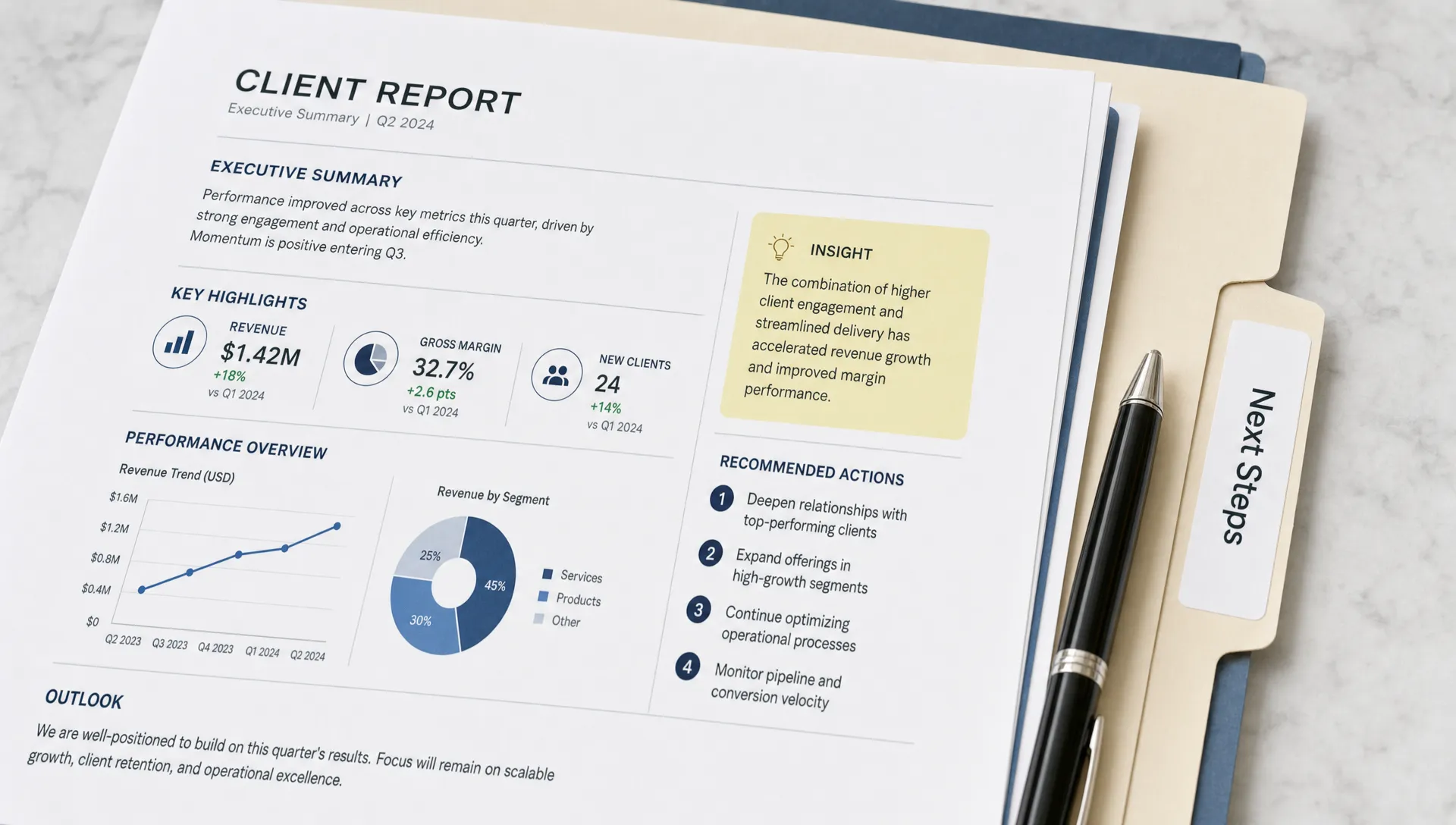
Most B2B client reporting is not ignored because clients are lazy. It is ignored because it asks busy people to interpret data the agency should have already translated.
A founder, CMO, VP of Sales, or RevOps lead does not open a report hoping to admire charts. They want to know whether the work is moving the business forward, what is stuck, what is changing, and what decision they need to make next.
That is the bar for B2B reporting clients actually read: it must reduce uncertainty, not add more tabs to a spreadsheet.
For agencies, better reporting is also a margin issue. If every report requires custom analysis, manual screenshots, Slack explanations, and a follow-up call to clarify what the numbers mean, reporting becomes unpaid strategy labor. The goal is not to create thinner reports. The goal is to create a repeatable reporting system that makes performance easier to understand and next steps easier to approve.
The real job of B2B reporting
A strong B2B report is not a recap of everything your agency did. It is a decision-support document.
It should answer four questions quickly:
- What changed since the last reporting period?
- Why did it change?
- Does it matter commercially?
- What are we doing next?
That sounds simple, but many agency reports bury those answers under channel-by-channel screenshots, vanity metrics, and exported dashboards. The client has to hunt for meaning. When that happens, they either skim the report, ask for a meeting, or stop reading altogether.
In B2B, the problem is even sharper because buying cycles are longer, attribution is messier, and revenue impact often appears weeks or months after the original campaign activity. A report that only says “traffic increased 18%” or “CTR declined 0.4 points” is incomplete. The client needs to understand whether that movement affects qualified demand, sales conversations, pipeline quality, or the next experiment.
The report is doing its job when a client can finish it and say, “I know what happened, I know what matters, and I know what we are doing about it.”
Start with the reader, not the dashboard
Before you choose metrics, choose the reader. Different stakeholders read reports for different reasons. A CEO may want risk and revenue implications. A CMO may want channel performance and strategic tradeoffs. A sales leader may care more about lead quality, speed to follow-up, and opportunity feedback than impressions or clicks.
If you send the same report to every stakeholder, you usually satisfy none of them.
| Client stakeholder | What they usually care about | What the report should emphasize | What to avoid |
|---|---|---|---|
| Founder or CEO | Growth, risk, cash efficiency, strategic direction | Pipeline movement, major constraints, decisions needed | Channel jargon without business context |
| CMO or marketing lead | Program performance, budget allocation, campaign quality | Trends, experiments, conversion paths, next optimizations | Raw data with no interpretation |
| Sales leader | Lead quality, account fit, follow-up, objections | SQL quality, meeting outcomes, CRM notes, feedback loops | Marketing-only success claims |
| RevOps or CRM owner | Data integrity, handoffs, attribution, process gaps | Source quality, routing issues, lifecycle stage accuracy | Unverified numbers or unclear definitions |
This does not mean creating four completely different reports. It means building one reporting foundation with a clear executive summary and optional detail sections for each stakeholder.
A practical rule: if the most senior reader only reads the first page, they should still understand the story.
Use a metric hierarchy clients can follow
The easiest way to make B2B reporting confusing is to present every metric as equally important. Sessions, impressions, MQLs, opportunities, cost per click, email replies, and close rates cannot all sit at the same level.
Instead, organize reporting into a hierarchy. Start with the business outcome, then move down into the leading indicators and execution details that explain it.
| Reporting layer | Purpose | Example metrics | Client question answered |
|---|---|---|---|
| Business outcome | Shows commercial progress | Pipeline sourced, opportunities created, meetings booked, revenue influenced | Are we closer to growth? |
| Funnel movement | Shows whether demand is progressing | Lead-to-meeting rate, MQL-to-SQL rate, demo requests, account engagement | Where is momentum building or stalling? |
| Channel performance | Shows which programs are contributing | Paid search conversions, organic assisted leads, email reply rate, webinar attendance | Which channels deserve attention? |
| Execution quality | Shows whether the work was shipped correctly | Campaign launches, QA issues, landing page tests, CRM routing accuracy | Did the machine operate as expected? |
Not every agency has access to closed-won revenue or complete CRM data. That is normal. What matters is being explicit about the visibility you do have.
For example, instead of pretending that form fills equal revenue, write: “We can currently see form submissions and booked meetings, but not opportunity value. Until CRM access is connected, meeting quality and sales feedback are our best indicators of pipeline fit.”
Clients trust reporting more when you state the limits of the data clearly.
Lead with a one-page narrative
The most readable B2B reports usually start with a short narrative before any detailed charts. Think of this as the performance memo: a concise explanation of what happened, why it matters, and what the agency recommends.
A strong opening page includes:
- A plain-English headline that summarizes the period
- Three to five key takeaways, ranked by importance
- A short explanation of the main performance driver
- A clear list of next actions
- Any decisions or approvals needed from the client
For example, a weak reporting headline might say: “June Paid Media Performance.”
A stronger headline would say: “Demo volume recovered after landing page changes, but SQL quality now depends on tighter industry targeting.”
The second version gives the client the story immediately. It also creates a natural bridge to the decision: should the next budget cycle prioritize more volume, or better fit?
This is where many agencies can improve quickly. Do not make the client infer the story from charts. Tell the story, then use charts as evidence.
Separate the dashboard from the report
Dashboards and reports are not the same thing.
A dashboard is a reference tool. It lets someone inspect live or near-live data. A report is a communication tool. It explains what the data means during a specific period and what should happen next.
When agencies confuse the two, they send clients a link to a dashboard and assume reporting is done. But most clients do not have the time, context, or desire to diagnose performance from raw visuals. They need interpretation.
A good reporting system can use dashboards in the background, but the client-facing report should be curated. Put the most important insights in the main report and move deeper charts into an appendix or dashboard link.
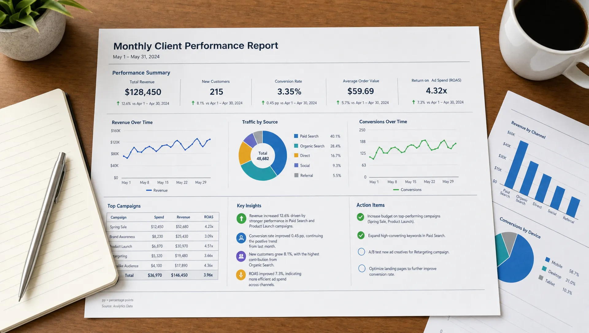
This also protects your team’s time. When the same dashboard feeds a consistent report template, strategists spend less time formatting and more time interpreting.
If your agency is still rebuilding reports manually every week or month, start by standardizing the inputs. Metric definitions, naming conventions, date ranges, and QA checks matter before automation. For a deeper operational view, Archer Scaling AI has a related guide on standardizing reporting and QA for B2B ad agencies.
Make every metric earn its place
A metric deserves space in the report only if it helps explain performance or guide a decision.
That does not mean you hide detail. It means you organize detail according to usefulness. If a metric is interesting but not actionable, it belongs in the appendix. If it changes what the client should approve, stop, fix, or fund, it belongs in the main narrative.
Here are examples of how to translate common metrics into useful reporting language:
| Raw metric | Weak reporting | Strong reporting |
|---|---|---|
| Website sessions | “Traffic increased 22%.” | “Traffic increased 22%, but demo requests were flat, so the next priority is conversion quality rather than more volume.” |
| Cost per lead | “CPL decreased to $84.” | “CPL improved, but sales accepted fewer leads, which suggests the lower cost came from broader targeting.” |
| Email reply rate | “Reply rate was 6.8%.” | “Reply rate improved after the new pain-point opener, so we will expand that messaging to the next segment.” |
| Organic clicks | “Organic clicks declined 9%.” | “Organic clicks declined mainly on non-commercial posts, while bottom-funnel pages held steady.” |
The difference is not the data. The difference is interpretation.
Clients read reports when the report saves them from having to translate numbers into implications.
Include the uncomfortable truth
Many reports are ignored because clients sense they are polished to avoid hard conversations. If performance is down, say so. If attribution is incomplete, say so. If the client’s sales follow-up is weakening campaign results, say so professionally.
B2B reporting should build trust, not just defend the agency.
A useful format is to label issues by ownership:
| Issue type | Example | Owner | Report language |
|---|---|---|---|
| Agency-controlled | Campaign QA issue, delayed creative, weak targeting | Agency | “We found the issue, corrected it, and added a QA step before the next launch.” |
| Client-controlled | Slow lead follow-up, missing CRM data, delayed approvals | Client | “This is limiting visibility and speed. We need access or approval by Friday to keep the timeline.” |
| Shared | Lead quality feedback, offer positioning, sales objections | Both | “Marketing and sales need a tighter feedback loop before scaling spend.” |
| External | Seasonality, market shifts, competitor activity | Neither fully | “We are adjusting expectations and testing a narrower segment in response.” |
This framing keeps the report constructive. It avoids blame while making constraints visible.
For service-based businesses, the same principle applies beyond classic B2B SaaS reporting. A useful marketing report should connect visibility, website performance, and conversion paths to real leads or calls. That is why conversion-focused partners like Sleek Web Designs frame website and SEO work around customer acquisition rather than vanity traffic alone.
Create a consistent reporting cadence
Clients are more likely to read reports when they know what to expect. A changing format creates friction. A consistent cadence creates a habit.
Most B2B agencies do not need one giant report for every situation. They need different levels of reporting for different rhythms.
| Cadence | Best for | Recommended format | Main purpose |
|---|---|---|---|
| Weekly | Active campaigns, launch periods, high-spend accounts | Short pulse update | Spot issues, confirm actions, prevent surprises |
| Monthly | Retainers, ongoing demand gen, SEO, content, paid media | Narrative performance report | Explain trends, document decisions, align next priorities |
| Quarterly | Strategy reviews, budget planning, executive alignment | Strategic business review | Reassess goals, channels, offers, and resource allocation |
The weekly update should not become a full report. It should be a short operational pulse: what shipped, what changed, what is blocked, and what happens next.
The monthly report should tell the performance story.
The quarterly review should challenge the strategy.
When those formats blur together, clients get too much information at the wrong time.
Automate assembly, not accountability
AI can make B2B reporting faster, but it should not remove strategic judgment. The highest-leverage use of automation is to eliminate repetitive assembly work so the strategist can focus on interpretation.
Good automation can help pull data from source systems, normalize date ranges, detect unusual changes, draft first-pass summaries, generate client-specific versions, and route reports through QA. But a human still needs to confirm the story, decide what matters, and own the recommendation.
| Reporting task | Good automation use | Human responsibility |
|---|---|---|
| Data collection | Pull metrics from approved sources on schedule | Confirm source accuracy and access gaps |
| Variance detection | Flag large changes from the prior period | Decide whether the change matters |
| Draft summaries | Produce a first-pass narrative from structured inputs | Rewrite for nuance, context, and client politics |
| QA routing | Check missing fields, date ranges, naming issues | Approve final report before sending |
| Follow-up tasks | Create action items in project or CRM systems | Own the client conversation and decisions |
This is especially important for agencies trying to protect delivery margin. Manual reporting assembly is one of the tasks that B2B marketing teams should never do by hand once the process is mature enough to systemize.
The mistake is automating chaos. If every account has different definitions, formats, and stakeholder expectations, AI will only help you produce inconsistent reporting faster. Standardize first, then automate.
Use a repeatable client report structure
A reliable report template does not need to be complicated. In fact, the best structure is usually simple enough that every account lead can follow it without reinventing the format.
Use this order:
- Executive summary: The main story, key takeaways, and decisions needed.
- Goal progress: How current performance compares to the agreed objective.
- What changed: The most important movements in the data.
- Why it changed: The agency’s interpretation, with evidence.
- What we did: Work completed during the period, only as it relates to outcomes.
- What happens next: Planned actions, tests, fixes, and owners.
- Risks and asks: Blockers, missing inputs, approvals, or client-side dependencies.
- Appendix: Supporting charts, raw tables, and deeper channel detail.
This structure keeps the report from becoming either too strategic with no proof or too tactical with no point.
The “risks and asks” section is particularly useful. It turns reporting into an operating mechanism. Instead of letting blockers live in Slack threads or account manager memory, the report documents what is needed to improve performance.
Common reasons clients stop reading reports
If reporting engagement is low, the cause is usually visible in the report itself.
The most common issues are:
- Too many metrics and not enough meaning
- No clear recommendation
- Activity reporting that does not connect to outcomes
- Inconsistent formatting from month to month
- Screenshots that are hard to read
- Data errors that damage trust
- Bad news hidden until the client asks
- No distinction between agency actions and client decisions
The fix is not always a prettier slide deck. Often, the fix is a stronger operating system behind the report: cleaner data, clearer ownership, tighter QA, and a consistent narrative structure.
Readable reporting is not a design problem first. It is an operations problem first.
Frequently Asked Questions
What should a B2B client report include? A B2B client report should include an executive summary, goal progress, key performance changes, interpretation, completed work, next actions, risks, and any decisions needed from the client. Supporting charts should be included only when they clarify the story.
How long should a B2B marketing report be? The main report should be short enough to skim in a few minutes, often one to five pages depending on account complexity. Deeper data can live in an appendix or dashboard, but the primary narrative should be concise.
Should agencies use dashboards instead of reports? Dashboards are useful for reference, but they do not replace reports. A dashboard shows data, while a report explains what the data means and what should happen next.
How can AI improve B2B reporting? AI can speed up data collection, variance detection, summary drafting, QA routing, and report personalization. It should support the strategist, not replace human judgment or accountability.
Why do clients ignore agency reports? Clients usually ignore reports because they are too long, too tactical, too hard to interpret, or disconnected from business decisions. Reports get read when they clarify progress, constraints, and next steps.
Turn reporting into a margin-protecting system
If your agency’s reports require too much manual work, too many custom explanations, or too many follow-up calls, the issue is probably not your team’s effort. It is the system behind the work.
Archer Scaling AI helps B2B marketing agencies install and run AI-powered operations systems for workflows like reporting, research, onboarding, CRM follow-up, and content ops. The process starts with a paid Margin Teardown that identifies the highest-leverage automation moves for your delivery model, with a roadmap and three automation opportunities.
If you want reporting clients actually read without adding more delivery labor, see how the system works with Archer Scaling AI.